Radwell's eCommerce customer journey.
My Role: UI designer, UX designer (Individual Project), Developer (Team Project)
The problem
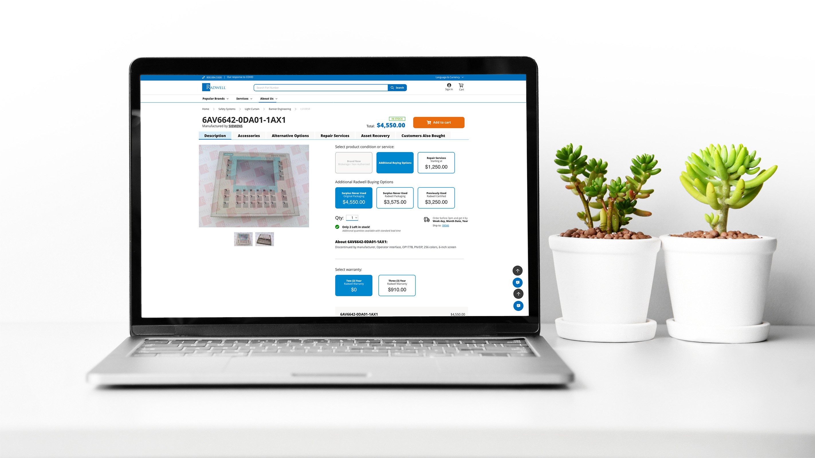
The product page is clutter with repetitive information and confusing design elements. The buying options are difficult to understand when adding an item to the shopping cart.
The solution
Adopt a cleaner design by simplifying the page to include relevant information on the first paint and only showing one call-to-action at the time but giving the flexibility to the user to explore all the buying options.
Tools
Adobe XD, Adobe Illustrator CC, Photoshop CC, Visual Studio, Maze.

Understanding the user needs
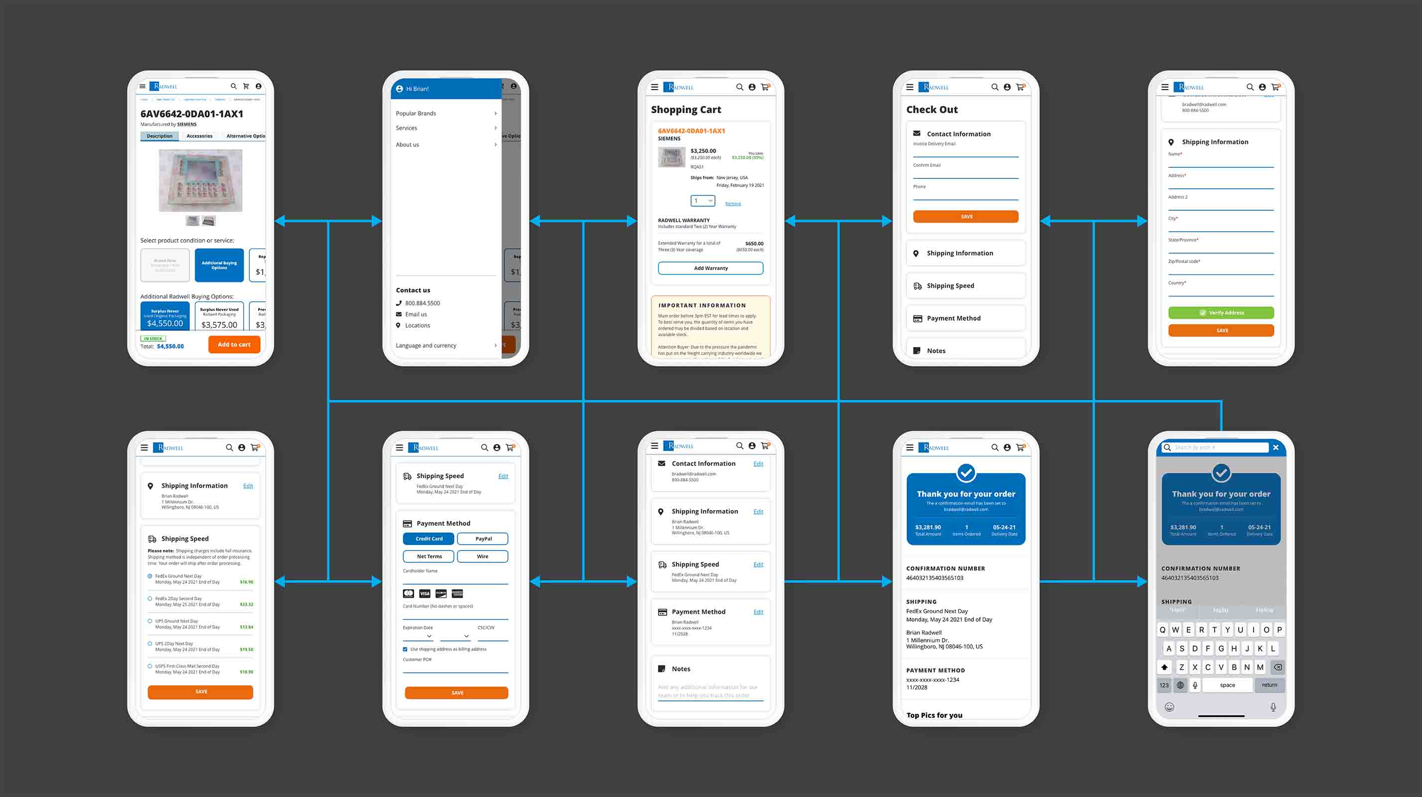
From research done, users want a less confusing and broken experience from begging to end. Most of the received feedback was around how the product page was clutter with repetitive information. The buying options had too many "add to cart" buttons, making it hard to know which one was the correct one, and the checkout experience wasn't seamless.

The product
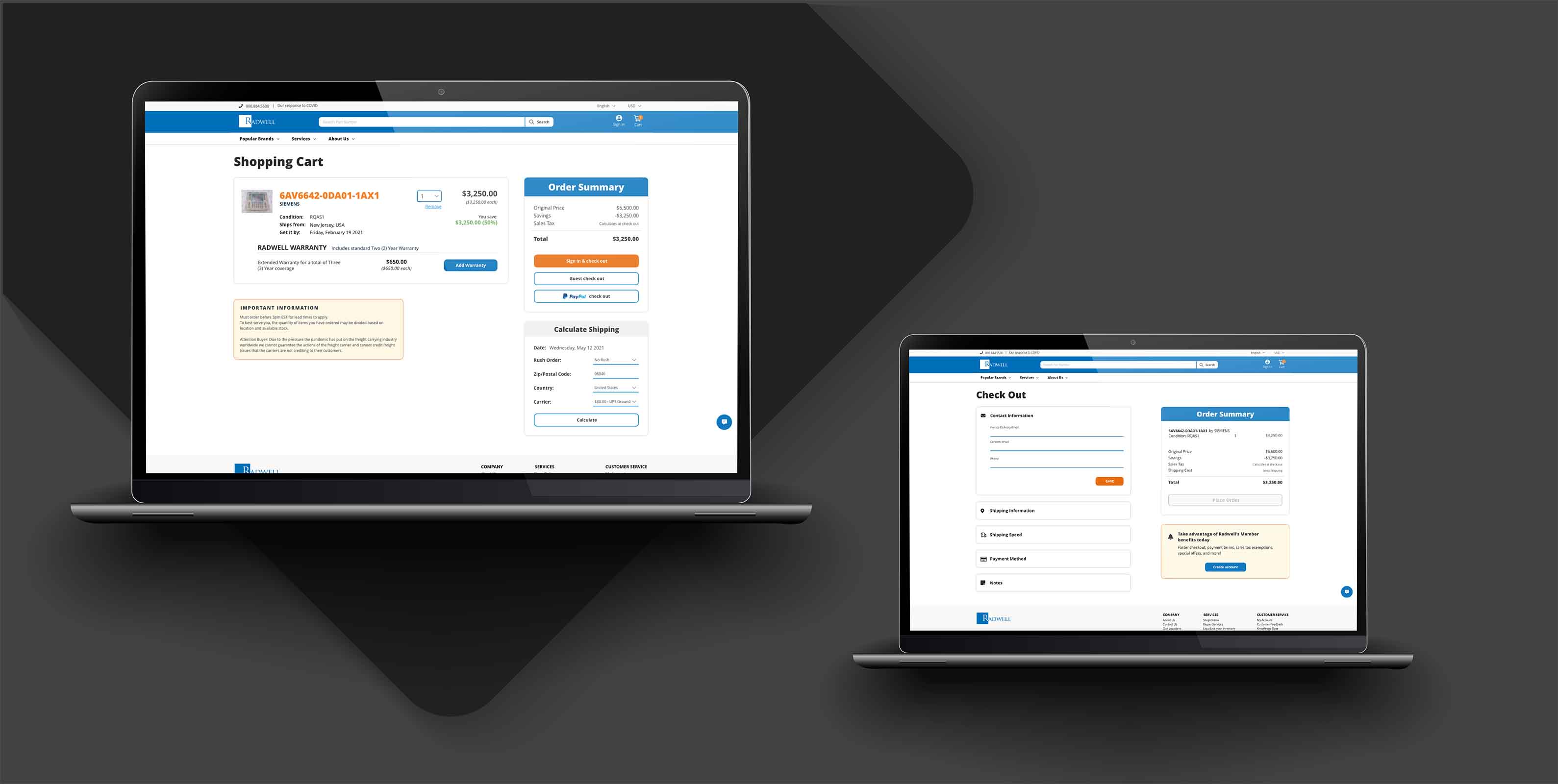
The company model is to provide every option they offer at the same time so the user can make an informed decision at the time of purchase. The problem was all this information was hard to digest, and the user had to constantly scroll thru the page and try to remember all of this information. Secondly, the checkout flow was so dated that new users called the company to make sure it was a legitimate business, and a large portion of existing users would much rather place an order by phone than use the website.
We created a design system to help bring constancy to the site and give it a modern look; we had to rethink how to present all buying options into a simple-to-digest page, how much of the existing information was redundant and what new helpful content we needed to add. We worked closely with back-end developers to make sure data we need implemented was accessible and that we had all the resources needed such as APIs and databases.

After launching phase 1 of the new design, Radwell saw a 7.36% conversion rate increase. This was quite a significant jump, and we were happy to see that it was working so well. However, we weren't done making changes to the site yet— we wanted to make sure that we had done everything possible to optimize the flow and make it as user-friendly as possible.
In order to do this, we conducted several rounds of user testing on the product details page to find out if our changes were improving usability and overall user experience (UX). We also looked at other metrics like bounce rates and time spent on site. Finally, after six(6) months of continuous optimization, we released the new design of the Product Details Page; it saw a 10.36% increase in traffic from previous months combined with an additional 4.25% conversion rate increase.